Illustrated Guide to ROC Curve and AUC Concepts
Table of Contents
What Are the ROC Curve and AUC, and Why Are They Important?
In binary classification problems in machine learning, models typically output a “prediction score” representing the probability of being a positive class. For example: a transaction is predicted to have a 0.9 probability of being fraudulent. In such cases, we need to set a classification threshold to determine at what score a transaction is considered fraudulent.
Different thresholds affect the model’s prediction results. Therefore, we need a method to observe model performance across all thresholds, which is exactly what the ROC Curve (Receiver Operating Characteristic Curve) and AUC (Area Under the Curve) provide.
ROC Curve (Receiver Operating Characteristic Curve)
Why Do We Need the ROC Curve?
Suppose we have a model that predicts whether a transaction is fraudulent (positive class), and the model outputs a probability score rather than a hard classification. For example:
- Threshold = 0.8: Only scores above 0.8 are considered fraudulent
- Threshold = 0.3: Scores above 0.3 are considered fraudulent
Different thresholds lead to vastly different results and affect metrics like precision and recall. The ROC curve allows us to observe how well the model performs in classification across all thresholds.
Confusion Matrix Is the Basis of the ROC Curve
The confusion matrix summarizes the difference between predictions and actual values and includes four types of outcomes:
- True Positive (TP): Actual positive and predicted as positive
- False Positive (FP): Actual negative but predicted as positive
- True Negative (TN): Actual negative and predicted as negative
- False Negative (FN): Actual positive but predicted as negative
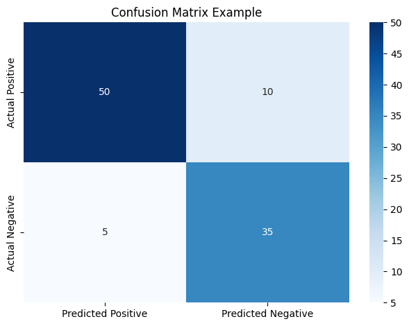
Figure 1: Confusion Matrix. Rows represent actual classes, columns represent predicted classes. Each cell corresponds to TP, FP, TN, FN.
These values are used to calculate the two core metrics for the ROC curve:
True Positive Rate (TPR):
$$ \text{TPR} = \frac{TP}{TP + FN} $$
False Positive Rate (FPR):
$$ \text{FPR} = \frac{FP}{FP + TN} $$
How to Plot the ROC Curve
The ROC curve is a plot with FPR on the X-axis and TPR on the Y-axis, showing model performance across various threshold settings.
By gradually decreasing the threshold from 1 to 0, each threshold produces a (FPR, TPR) pair. Connecting these points forms the ROC curve.
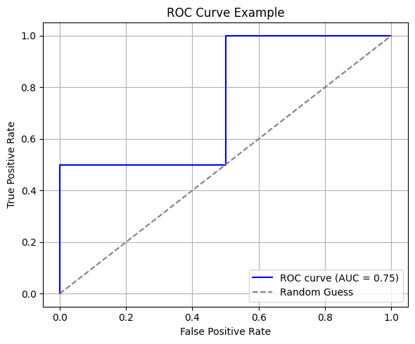
Figure 2: Example of an ROC curve. The dashed line represents random classification. The closer the curve is to the top-left corner, the better the model.
What the ROC Curve Tells Us
- The closer the curve is to the top-left, the better the model at distinguishing between positive and negative classes
- A curve near the diagonal line (random guess) indicates poor model performance
- A curve below the diagonal implies the model is inversely predicting (inverted predictions might actually be useful if reversed)
AUC (Area Under the Curve)
Definition of AUC
AUC is the area under the ROC curve, and its value ranges from 0 to 1. AUC represents:
The probability that the model ranks a randomly chosen positive instance higher than a randomly chosen negative instance.
Interpretation of AUC Values:
| AUC Value | Interpretation |
|---|---|
| 1.0 | Perfect classification |
| 0.8 ~ 0.9 | Good classification ability |
| 0.5 | Equivalent to random guessing |
| < 0.5 | Model predicts opposite of truth |
Visual Understanding of AUC
AUC can be intuitively understood through score distribution plots. The figure below shows the model’s score distributions for positive and negative samples:
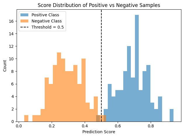
Figure 3: Positive samples generally have higher scores than negative ones, indicating good ranking ability and high AUC.
Why Use ROC Curve and AUC Metrics?
The ROC curve and AUC have several key advantages:
- Threshold-independent: Evaluate model stability across all thresholds
- Good for imbalanced datasets: Not affected by severe class imbalance
- Useful for model comparison: Helpful in comparing classification ability across models
Below is a comparison between Logistic Regression and Decision Tree models:
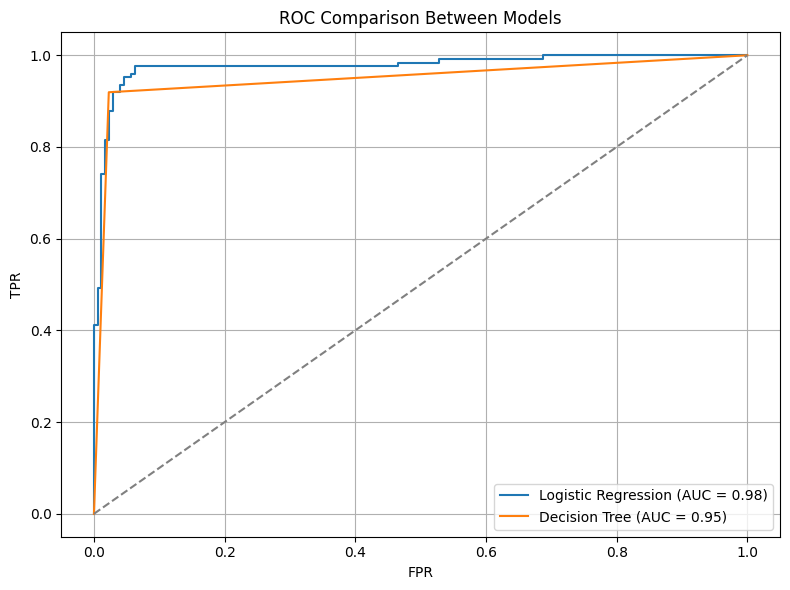
Figure 4: Comparison of ROC curves for two models. A higher AUC indicates stronger classification ability.
Python Example: Plotting ROC Curve and Calculating AUC
Here is a sample implementation of ROC and AUC using scikit-learn:
import numpy as np
import matplotlib.pyplot as plt
from sklearn.metrics import roc_curve, auc

# Simulated data
y_true = np.array([0, 0, 1, 1])              # True labels (0: negative, 1: positive)
y_scores = np.array([0.1, 0.4, 0.35, 0.8])   # Predicted scores

# Compute FPR, TPR, and AUC
fpr, tpr, _ = roc_curve(y_true, y_scores)
roc_auc = auc(fpr, tpr)

# Plot ROC curve
plt.plot(fpr, tpr, label=f'ROC curve (AUC = {roc_auc:.2f})')
plt.plot([0, 1], [0, 1], linestyle='--', color='gray', label='Random Guess')
plt.xlabel('False Positive Rate')
plt.ylabel('True Positive Rate')
plt.title('ROC Curve Example')
plt.legend()
plt.grid(True)
plt.tight_layout()
plt.show()
Notes
- Applicable only to binary classification: For multi-class problems, use One-vs-Rest transformation
- Ignores probability calibration: AUC only considers score ranking, not the accuracy of predicted probabilities
- May be misleading in real-world use: A high AUC doesn’t always translate to business value
Summary
ROC curves and AUC are essential tools for evaluating classification models, especially in situations where:
- The model outputs probability scores
- The data has an imbalanced class distribution
- You want to compare overall classification ability across models
For real-world applications, it is recommended to use them alongside other metrics like Precision-Recall and F1-Score for a more comprehensive evaluation.
Further Reading and References
Disclaimer: All reference materials on this website are sourced from the internet and are intended for learning purposes only. If you believe any content infringes upon your rights, please contact me at csnote.cc@gmail.com, and I will remove the relevant content promptly.
Feedback Welcome: If you notice any errors or areas for improvement in the articles, I warmly welcome your feedback and corrections. Your input will help this blog provide better learning resources. This is an ongoing process of learning and improvement, and your suggestions are valuable to me. You can reach me at csnote.cc@gmail.com.